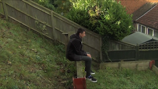
We originally decided to use one of the images that we took for the poster, however we decided that the image wouldn't work because conventionally LWL reviews use a screenshot from the film because they wouldn't have access to the images that we do. For this reason we watched through the short film and took a screenshot at every opportunity we saw a fitting image.
Here are the screenshots that we took:
Most of these images would somewhat fit the film, however we decided that there was one that is better than the rest and that is this one:
We decided that this would be the best image because it represents how the character is feeling for most of the film and it represents the overall feel of the film. Also, on the day we filmed it was cloudy which added to the overall feel of the footage. Although it doesn't show both of the characters from the film we felt that it was not necessary to show both characters as this image is of the main protagonist.Comparison of the three main images:
As you can see, we did have 3 main images that we though about using but one of them couldn't be used because it was an image taken at a different time and not a screenshot from the film. We also thought that out of the 2 screenshots that one of them represented the film better that the other one.


No comments:
Post a Comment