Advanced Portfolio Evaluation - Question 1 - In what ways does your media product use, develop or challenge forms and conventions of real media products? - Sam Swinson
Each of the 3 media products that I created have key conventions that are used to create them. This means that there are key conventions of a short film, a short film poster and a Little White Lies review. When creating each of these 3 media products I stuck to some of the key conventions, as well as, changing or developing the conventions that are normally used. Also, real short films tend to deviate a lot from the key conventions because lots of short films are experimental which means that create their own style using lots of different conventions.
To find out some of the conventions that I would have to follow when creating my media products I had to do some research into real media products that are similar to the ones that I created. I did the research in the first stages of each individual media product which meant that I could take the knowledge I learned from the research and use it to develop my media products.
Short Film:
During the Research and Planning stage of making the short film, I analysed 7 short films. As a group, we each had to analyse at least 5 different short films. This meant that we would have a good understanding of the key conventions that are in a short film because between the whole group we analysed around 17 different short films. The short films that I analyse used lots of different techniques including different narratives and different uses of Mise en Scene. Here is a list of the 7 short films that I analysed:- "Alive In Joburg" - Neill Blomkamp
- "Two & Two" - Babak Anvari
- "Money Box" - Muzappar Osman
- "Snap" - Manolo Celi
- "Gone Goodbye" - Keith Rivers
- "Musca" - Stefan Parker
- "Future Inc" - Martin Stirling
Analysing these short films showed me these key conventions of short films:
- Normally between 5 and 10 minutes in length
- No longer than 40 minutes
- Has to be an original motion picture
- Low budget:
- Produced by an independent production company
- Limited number of locations
- No big name Hollywood actors
- Only one or two main characters
- There is often some sort of 'twist' in the storyline to make it interesting.
- They either deal with an everyday situation that the audience can relate to or they deal with an unrealistic situation.
Here are three of the short films that I analyse, what each short film taught me and how I tried to implement that into our short film.
Short Film 1: "Future Inc" - Martin Stirling
About the Film (Director, Release date, Overall plot and Issues):
This short film is a 5 minute short that was created by Martin Stirling. It was released on the 7th May 2012 and it was made in 48 hours. I found this short film on Vimeo which is a video sharing platform.The film's protagonist is a woman called Rose. Rose is a lonely person who works at a job that she is not enthusiastic about and her work colleagues poke fun at here during the day. Also, some of her colleagues take advantage of her by making her do their work. While at home one evening she stumbles across a 'new social media' called 'Future Inc' where you can talk to people from the future. Later on, we find out that it is just people sitting behind monitors pretending to be from the future. Rose keeps talking to this person from the future and she finds a way of meeting him which is by putting herself into her chest freezer and she freezes herself.
This short film plays with the idea of time and how you can freeze yourself in time to be alive in the future. Also, this plays on the theme of loneliness, specifically it emphasises how lonely people can easily be manipulated by other. This is due to the people they speak to online being the only people in their lives that take an interest in what they are doing.
Concepts:
I will be applying 3 media concepts to this short film. I will apply:- Narrative
- Media Language
- Representation
Analysis:
Narrative:- This short film is an open-ended narrative structure that leaves the audience on a cliffhanger.
- This narrative style is very interesting and I could use it in my short film because it keeps the audience questioning the film and it means they have to focus on the smaller details in the film instead of having everything wrapped up at the end of the film.
- This means that the audience doesn't know if the protagonist (Rose) ever makes it to the future to meet the person she has been talking to.
- Additionally, this is a chronological structure so all the events are in order which makes the film easier to follow because of the clear path that the story takes.
- Ronald Barthes narrative theory can be applied to this short film:
- His theory is about 5 narrative codes.
- 2 of his codes, the enigma code, and the action code can be applied to the Future Inc short film.
- The enigma code is when some information is withheld from the audience to intrigue the audience into film and it gets them to look closely for answers to their questions.
- In this short film, the enigma code is used very effectively because the audience doesn't know who the person that Rose ( the protagonist) is talking to.
- Throughout the piece there are subtle hints that it is one of her colleagues, but, the audience have to look very closely for them and it only makes sense near the end of the film.
 |
| Figure 1 |
- For example, in the first scene of the film Rose ( the protagonist) is talking to QuirkyGuy (internet man that she doesn't know).
- This is a close-up over the shoulder shot of the two characters as they are talking (Figure 1).
- The man starts to yawn saying the dialogue "sorry, it's doing this and the night job."
- This suggests that the man may be low on income so he as to work 2 jobs and one of them being pretending to be from the future and talking to people anonymously on the internet.
- Also, the Barthes Action Code can be applied to this short film. However, this is a loose interpretation of the code.
 |
| Figure 2 |
- In the third scene of the film Rose ( the protagonist) goes to get some ice cream from the chest freezer that she has (Figure 2).
- This a mid-shot, but, the interesting thing about this shot is that the Rose ( the protagonist) walks out of the frame and then there is just this shot of the freezer on it own for a few seconds.
- This makes the audience ask the question why is there a pause after she leaves the frame.
- On top of this, the pause changes the faster pace of the start of the film because there were not many pauses in the start of the film.
- This suggests that the freezer is going to be used later on in the piece for some action and it is used by Rose ( the protagonist) to freeze herself in time (Figure 3).
- Also, it is used to create enigma because the audience are asking themselves the question of why is there a shot of this freezer.
 |
| Figure 3 |
- Vladimir Propp's theory can, also, be applied to this short film:
- His theory is that there are archetype characters in most narratives.
- Hero - Rose - she seeks not being lonely and having someone to care about her.
- Donor - Mason Gill - he provides the social network that Rose used so that she is not lonely and it helps Rose find someone to talk to.
- Villain - Mason Gill - the social network that he has created is fake which means that Rose is given a false sense of being befriended.
- Princess - QuirkyGuy - this is the person that Rose is talking to on the internet and in Rose's mind he will be her reward for freezing herself in time.
- Dispatcher - QuirkyGuy - he wants to meet Rose and that is what makes her try to freeze herself in time and he dispatches her on her mission to not be lonely.
- Helper - Mason Gill - he creates that social network that makes Rose want to freeze herself in time
- In addition, this is a restricted narrative and the film is shot in a clever way to keep it a restricted narrative:
- For example, when Rose (the protagonist) starts to exercise, because she wants to be in good shape when she meets the man from the future she is talking to, an extreme long-shot is used and slit framing is used to block out large portions of the frame (Figure 4).
 |
| Figure 4 |
- This shows Rose's (the protagonist's) struggle to get fit and it shows this to the audience from a third person perspective.
- This symbolises that others can only see a part of someone because they don't know what is going on in their mind.
- Also, it could symbolise that lonely people have quite a fixed mindset and are not open minded.
 |
| Figure 5 |
- Furthermore, a lot of the frames throughout the piece are very tightly framed, for example, (Figure 6) this is a mid shot, but, it was framed carefully to only show the important things.
- It only shows the protagonist, her tablet (prop), and the sofa (prop) that she is sitting on.
- This represents the closed mind of a lonely person and it creates the restricted narrative.
 |
| Figure 6 |
- This short film has lots of re-presentation in it through iconography, its genre, the characters and the issues it relates to.
- Iconography:
- In the film Rose (the protagonist) gets ice cream from her chest freeze (Figure 7).
- Ice cream is often used by or eaten by lonely people.
- It is iconic for showing loneliness in films and this is because in real like when we are lonely or bored we will go to get something to eat.
 |
| Figure 7 |
- Social Groups:
- This film mainly shows middle-class people.
- We know this because where she works people are wearing smart-casual costume (Figure 8).
 |
| Figure 8 |
- Also, the few shots that we can see of her house show that she has food and other things like clothing meaning she is not struggling for money (Figure 9).
 |
| Figure 9 |
- Status:
- In the film we see the different status levels of people and how they individually affect Rose (the protagonist)
- For example, her work colleagues, who have the same 'official status' as Rose, but, because they have friends they pick on Rose (Figure 10) as they know she is lonely and consider themselves to have a higher status.
 |
| Figure 10 |
- Also, her boss has a higher status that her in terms of power because he can dump lots of work on her desk for her to do and make her do in an unfair time frame (Figure 11).
- This links to Claude Levi-Strauss's narrative theory of binary oppositions Becuase Rose (the protagonist) is powerless and her boss is powerful.
- However, he abuses his power showing that him having the power is bad.
 |
| Figure 11 |
- Genre:
- This short film is part of the social realism genre.
- This means that the characters are meant to give the audience a true representation of the character that is in this situation.
- The important thing to remember with this is that it is a re-presentation of real life so it is someone's interpretation of real life.
- For example, the film deals with the issues of loneliness and the internet which are real things happening in society.
- Character:
- is a lonely person who seeks love and some attention.
- she does the stereotypical things that a lonely person does, for example, she eats ice cream and snacks whilst sitting on the internet not really doing much (Figure 12).
- Rose (the protagonist):
 |
| Figure 12 |
- she shows signs of a traditional view of femininity where people can easily take advantage of her, for example, her boss.
- Then in the middle of the film, she changes to become a more modern view of femininity because she stands up for herself, for example, her colleague tries to make her do his work (Figure 13).
 |
| Figure 13 |
- Issues:
- This short film deals mainly with 2 issues:
- Loneliness - how people can easily take advantage of lonely people.
- Internet - how you don't know who you are talking to online and how it can effect the victim of this abuse of trust.
The opening is put together in such a way that intrigues the audience and already tells the audience about the characters:
- The first shot is a close-up of the protagonist named Rose (Figure 14).
- This is from a very high angle which suggests that the audience is looking down on Rose because she has a low status.
- This symbolises the audience looking down on Rose as her colleagues do.
- This opening is very will put together and it inspires me to create an opening like it where the audience can build up a small character profile within the first few seconds of my short film.
 |
| Figure 14 |
- Also, during Rose's presentation to the rest of her colleagues, there is an extreme close-up shot on a defibrillator bracelet (prop) that she is holding (Figure 15).
- This suggests to the audience that they could be important for the same reason that the freezer is important to the story because of Barthes Theory of Action Codes.
- This is why there is a focus on the bracelet because it is what she uses to meet the person she has been talking with online (Figure 16).
 |
| Figure 15 |
 |
| Figure 16 |
- Furthermore, in the opening, there is a part where the audience go inside the heads of the protagonist's colleagues as they pick on her (Figure 17).
- This is interesting because it switches the perspective of the audience and it takes the audience's focus away from Rose and onto her colleagues.
- To help with this a wide depth of field is used so that Rose's hand is out of focus and the colleagues are in focus.
- We focus on the colleagues just after a diegetic sound from the defibrillator.
- This is an inspiring technique because it is not seen often in most short films and it is a clever way for the audience to learn new things about the characters.
 |
| Figure 17 |
What this short film taught me:
This short film made me think about how props can be used in the opening scene of a short film and the closing scene of a short film to help add deeper meaning to the opening and closing whilst, also, creating a slight hint of a circular narrative. Furthermore, this short film is very clever in the way that it uses the camera in the opening scene because it allows the audience to pick up subtle information about the characters, for example, the high angle close up on Rose (the protagonist) shows that the audience is looking down on her which represents her low status. In addition, this short film sticks to the 5-minute length and it only has one main character, however, there are lots of other characters in the background of this short film. In our short film we tried to make the opening and the closing key parts of the short film and create them in such a way that portrayed that made the opening a closing have a deeper meaning, for example, the football prop is used heavily in the opening and then it is used heavily in the third scene and the audience can clearly see a contrast in the protagonist's emotions because now he is using the football on his own.
Short Film 2: "Two & Two" - Babak Anvari
About the Film (Director, Release date, Overall plot and Issues):
This short film is a 6 minute short that was created by Babak Anvari. It was released on the 17th September 2011. I found this short film on YouTube which is a video sharing platform.This short film is based in a classroom that is in Iran. The film starts by showing the students in the classroom then the teacher comes in. We immediately see that all of the children are very disciplined as they do what the teacher says straight away. Then the children are informed that there will be some changes in the school by the headmaster. This is because now the students are going to be taught what the teacher want or believe in. The children are now taught that two plus two equals 5 instead of equalling 4. However, 1 student disagrees with the teacher and gets killed because he keeps on saying that it equals 4. Finally, at the end of the film we see a student write out 2 + 2 = 5 then he scribbles it out and writes 4.
This short film deals with the issue of authority and challenging authority. This is because the authority (the teacher) is trying to inflict their views on to others. Also, it deals with the issue of beliefs because the student that challenges the authority truly believes in what he is saying and he sticks by that for the whole film. It conveys the message that there will always be powerful people that will force the wrong views onto others and the people that stand up for what they believe in will suffer in some way.
Concepts:
I will be applying 3 media concepts to this short film. I will apply:- Narrative
- Media Language
- Representation
Analysis:
Narrative & Media Language:- Todorov's 5 part narrative theory can be applied to this short film.
- Also, Barthes narrative theory about codes can be applied to this short film.
- Levi-Strauss's narrative theory of binary opposites can be applied to this film as well.
- The film starts with a close-up on a blackboard that zooms out and tracks backwards to show an extreme long shot with some children in a classroom (Figure 1).
- This establishing shot shows the setting for the film and the classroom the film is set in us very basic with grey walls which is a neutral colour.
- On top of this, we can see that all the characters in the classroom are boys and there are no girls in the room which raises the issue of equality.
- This is because in the area of the world that this film is set the views on women are very stereotypical which suggests why only boys are in the class because only boys are worthy to learn in that part of the world.
- This is the Equilibrium part of Todorov's narrative theory because at this stage in the story everything is normal.
 |
| Figure 1 |
- After this the teacher walks in and as soon as the door is opened the students stop talking and stand up to show respect (Figure 2).
- This suggests that the students are well disciplined.
- Also, this shows Levi-Strauss's narrative theory of binary opposites because the students are smaller than the teacher which represents authority vs powerless.
 |
| Figure 2 |
- Then there is a mid shot of the teacher as he looks at the students (Figure 3).
- There is a zoom into the wall speaker behind him as the headmaster speaks.
- As the zoom in happens there a switch from a wide depth of field too shallow depth of field to put the audiences focus on the speaker.
- This created Barthes code of enigma because the audience are wondering why the focus is on the speak and it connotes that the change being described is important to the story.
- This is important to the students because the diegetic dialogue is "there will be some changes in the school."
- This is the Disruption part of Todorov's narrative theory because the once balanced world is now being disrupted by the change the headmaster is making.
 |
| Figure 3 |
- After the announcement from the headmaster has finished there is a mid shot of the teacher as he writes on the board "2 + 2 = 5" (Figure 4).
- This is also part of the Disruption stage as now the audience knows exactly what the distribution to the balanced world is.
- After the teacher has finished writing it on the board he turns to the class to see how they react.
- This creates enigma because the audience is questioning why that has been written on the board when they know it equals 4.
 |
| Figure 4 |
- Next, there is a mid shot of one side of the class as they say five (Figure 5), however, there is one student that is putting his hand up to say that it equals 4.
- This is the first time that we see a powerless person stand up to the authority.
 |
| Figure 5 |
- Then there is an over the shoulder shot looking at the teacher in a mid shot (Figure 6).
- The teacher is saying to the student that he should not question what he is being taught.
- This represents the authority forcing their views onto others and making me believe in the same things that the authority believe in.
 |
| Figure 6 |
- After this, another student stands up to the teacher and says it equals 4.
- This is a mid shot of the student at eye level angle to represent that the audience is on the same status level with the student which allows them to sympathise with him (Figure 7).
- This is the Confrontation part of Todorov's narrative theory because the student has seen the disruption and is trying to resolve it.
 |
| Figure 7 |
- Next, there is a close-up on the teacher as he shouts the diegetic dialogue"SILENCE" (Figure 8).
- This clearly shows Levi-Strauss's narrative theory because the student is powerless vs the teacher who is powerful and the teacher gets angry when the student tries to take his power.
- Additionally, this is used of Barthes Action Code because the audience can sense that something is going to happen because of how angry the teacher is getting.
 |
| Figure 8 |
- After this, there is a slow zoom from a mid-shot to a close-up of the student as he stands.
- As the teacher has left the room the other students start saying things like "you will get us all in trouble" and "he's going to kill you" (Figure 9).
- In modern terms "he's going to kill you" is an expression of a figure of speech, however, in a place like the setting of the short film where dictation is still used this is taken more literally.
- On top of this, this foreshadows that the student is going to be killed.
- However, the student is still not backing down and his facial expression shows determination which suggests he his going to stick to his beliefs.
 |
| Figure 9 |
- Then the teacher comes back with some other students who are model older students.
- There is a close-up on the teacher with the older students out of focus in the background (Figure 10) and their costume is the same as the younger students, but, the have a red patch on their arms.
- This represents Nazism because it is very similar to the patch warm by a Nazi soldier.
- This means that these people are following the orders of the higher powers and that is what the young students will one day become.
 |
| Figure 10 |
- Next, there is a close-up over the shoulder shot focusing on the young student as he is at the front of the class and has been asked to complete the sum.
- His facial expression shows determination and this suggests to the audience that he is going to stick to his beliefs.
 |
| Figure 11 |
- After this, the next few shots are editing in a fast pace to add to the authority that they have over the student and adds emphasis of what might happen to the audience (Figure 12, 13, 14).
- This is due to the contact in pace which emphasises the point more.
- Also, this adds enigma because the audience is questioning why the older students are holding up air guns.
- This begs the question are they going to kill the student.
- On top of this, the audience is guessing what till happen next with Barthes Action Code.
 |
| Figure 12 |
 |
| Figure 13 |
 |
| Figure 14 |
- Then the student writes "4" on the board and turns back around to face the class.
- The boy is then shot by the older students which is a huge shock to the audience and to the other classmates.
- Then the is a cut to a close-up of the writing and the blood on the board which emphasises the shock to the audience (Figure 15).
- This is the Resolution part of Todorov's narrative theory because the student who was causing a disruption has been dealt with.
 |
| Figure 15 |
- Next, there is a cut to the teacher as he writes out "2 + 2 = 5" and turns back to the class.
- This shows the circular narrative part of the film because it is the same shot as the at the start, however, both the students and audience have learned what happened when you challenged the authority.
- Also, this is the New Equilibrium part of the story because this is what the new balance will be like for the world.
 |
| Figure 16 |
Representation:
- Representation is used effectively in this short film.
- The teacher is supposed to represent authority and how authority cannot be challenged because authority decides what is right and wrong.

- Additionally, the student represents someone who truly believes in what they think because he didn't back down even when authority got tough with him.

- Something interesting about the way that it represents this issue of challenging authority is that if people in real life didn't challenge authority then life would not be the same as we know it.
- Finally, the final shot is a close-up (Figure 17) on a student crossing out the "5" and instead writing "4".
- This represents that some people stand up to authority without actually physically standing up to the authority.
 |
| Figure 17 |
What this short film taught me:
This short film was very inspiring with the way that it used narrative and patterns. It used a circular narrative to clearly show to the audience the path that the students had been on through the short film. From this short film we tried to implement a circular narrative into our short film, however, we ended up using patterns within the short film, for example, the 1st and 3rd scene's are in the same place and this clearly shows the emotional journey that the protagonist has been on in the time between those scenes. Also, in the final scene the shots are repeated so at the start of the scene there are a variety of shots sizes and distances and they all have a long duration and then at the end of the scene some of the shots are repeated and they have a shorter duration to build up tension towards the ending.
In addition, the ending of this short film has a deeper meaning which is a convention that we tried to add to our short film by subtly showing the audience that the protagonist is content with what he is doing with a close up on his face before a cut to black.
Additionally, this short film remains in the 5-10 minute lengh and it has one main character, however, there are lots of other secondary characters that are involved in this short film.
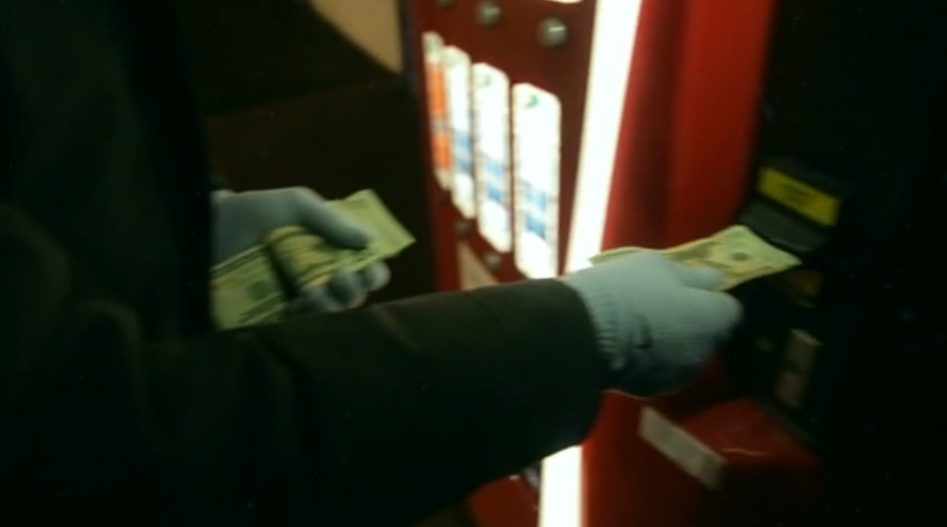
Short Film 3: "Money Box" - Mazappar Osman
About the Film (Director, Release date, Overall plot and Issues):
This short film is a 5 minute short that was created by Muzappar Osman. It was released 25th March 2014. I found this short film on Vimeo which is a video sharing platform.
This short film is about a man that has a little amount of money. The protagonist takes his money to a cold drink vending machine and tries to buy a drink by inserting his money into the machine. However, he realises that he doesn't have enough money for a drink so he ejects the money from the machine. Then the protagonists realised that the machine gave him $10 when he only put in $1. So the protagonist does this again and again until he has $1000. Then he gets too greedy and he puts all of his money, $5820, into the machine, but, the power goes out in the city and the machine turns off. This means that the protagonist has lost all of his money.
This short film is a very original way of dealing with the issue of greed and money. It is done in such a way that gets the audience to think what they would do in the situation the protagonist is in. This film makes the audience think whether money makes a human better or more powerful than a human with less money.
This short film is a very original way of dealing with the issue of greed and money. It is done in such a way that gets the audience to think what they would do in the situation the protagonist is in. This film makes the audience think whether money makes a human better or more powerful than a human with less money.
Concepts:
I will be applying 3 media concepts to this short film. I will apply:
- Narrative
- Media Language
- Audience
Each concept will be colour coded to make it easier to see where I have applied each concept to the short film.
Analysis:
Narrative & Media Language:
- Todorov's 5 part narrative theory and Barthes narrative theory can both be applied very well to this short film.
- The film begins with an establishing shot of New York city at night when it is snowing.
- This is an extreme long shot (Figure 1) that shows the audience where the protagonist is.
- This is the Equilibrium part of Todorov's narrative theory where everything is normal and there is a sense of balance in the story world.
- This is a circular narrative which is used to emphasise the of the protagonist because the only difference between the start and the end is that the audience has seen the protagonist lose all of his money.
- Additionally, this is an unrestricted linear narrative that is told, and the plot is in a chronological order.
 |
| Figure 1 |
- Then there is a mid shot of a cold drinks vending machine (Figure 2).
- This shot has tilt camera movement that tilts upwards to show the whole machine.
- This is a use of Barthes Action Code because the audience can predict that something is going to happen with this vending machine because the shot is a long duration.
- Additionally, this creates Enigma which is another of Barthes codes because the audience is questioning what the importance of this vending machine is.
 |
| Figure 2 |
- After this, there is an extreme long shot of the protagonist as he walks slowly towards the vending machine (Figure 3).
- This creates enigma because the audience can see the protagonist's face due to his costume hiding it so the audience is wondering what kind of a person the protagonist is.
- On top of this, there is non-diegetic background music that is slowly building up which matches the pace of the editing so far in the film.
- The non-diegetic background music is very eerie thriller-style music which adds to the enigma.
- The protagonist body language as he walks connotes that he is sad or slightly depressed or upset.
 |
| Figure 3 |
- Next, we see a mid shot of the protagonist as he puts a note into the vending machine, however, we are not sure what the amount of money is (Figure 4).
- This adds enigma because there must be a reason as per why the audience is watching the protagonist put some money into a vending machine.
- This means that using Barthes action code the audience are trying to predict the importance of the vending machine, for example, it will give the protagonist something he doesn't have.
 |
| Figure 4 |
- Then we get a POV shot from the protagonist perspective of the amount of money that he has put into the machine which is $1 (Figure 5).
- This suggests to the audience that the amount of money is significant to the story.
- Also, as there is a cut to this shot there is a crescendo in the non-diegetic background music to suggest the importance of it and emphasise this to the audience.
 |
| Figure 5 |
- Next, we see that he cannot afford any of the drinks in the vending machine and we see a mid shot of his facial expression that shows frustration (Figure 6) suggesting that he is very thirsty.
- Then there is an extreme close-up on the money as it comes out of the vending machine because it is a $10 note (Figure 7).
- In addition, there is shallow depth of field to bring all of the audiences attention to the money which connotes its importance.
- This is a surprise to the audience and they are just as confused as the protagonist is and this adds to the enigma.
- On top of this, as the not comes out the non-diegetic background music fades out.
- This is the Disruption part of Todorov's narrative theory because the vending machine is changing or disrupting the equilibrium.
 |
| Figure 6 |
 |
| Figure 7 |
- Then there is a big close-up on the protagonist's face (Figure 8).
- This shows his facial expression which suggests to the audience that he is confused and he is trying to work out what happened.
- This is the Recognition part of Todorov's narrative because the protagonist is working out what the disruption is.
 |
| Figure 8 |
- After this, there is a close-up shot showing the protagonist putting the $10 back into the vending machine (Figure 9).
- This adds to the enigma because the audience is wondering whether the protagonist will get more money again.
- Then there is a close-up as he ejects the money from the machine and he gets $100 from it (Figure 10).
- This is a shock to the audience because the protagonist is getting 10 times what he puts in.
 |
| Figure 9 |
 |
| Figure 10 |
- Then we get a mid shot of the protagonist as he is collecting the $100 from the vending machine (Figure 11).
- We can see his facial expression and it shows joy and happiness, but, the audience is starting to suspect at this point maybe he will take this too far and keep wanting more money.
 |
| Figure 11 |
- Then there is a clever sequence where the protagonist lifts the money up to his face and the camera tilts up in a mid shot with the money (Figure 12).
- Shallow depth of field is used to put the focus on the money then there is a focus pull and it changes to a wide depth of field and puts the focus on the happy and intrigued facial expression of the protagonist (Figure 13).
- Then there is a cut to an extreme close-up of his eyes looking around which connotes he is planning to put more and more money in the machine to get more back (Figure 14).
- At this point the audience can sense and predict that he should stop putting the money in the machine, but, he continues to.
 |
| Figure 12 |
 |
| Figure 13 |
 |
| Figure 14 |
- After this, the protagonist goes to his bank to get out, even more, money and we can tell he shouldn't have done this through Bathes action code.
- This is because the non-diegetic background music crescendoed when he gets his card out and as if so something bad will happen.
- Then there a close-up of him putting the money into the machine (Figure 15) and there is almost complete silence which represents the 'calm before the storm' meaning that everything is going to go wrong.
 |
| Figure 15 |
- Next, we see an extreme close-up on the machine showing that the protagonist has put in $5820 into it (Figure 16) and he is very happy because he thinks he will get lots of money back and this was shown by his happy facial expression in the previous shot.
- Then we return to the opening establishing long shot, however, all the lights in the city go out (Figure 17).
- This suggests that all the power has gone out in the city.
- This is the Resolution part of Todorov's narrative theory because the city has gotten rid of the disruption.
 |
| Figure 16 |
 |
| Figure 17 |
- Then we cut back to the protagonist with a big close-up (Figure 18) and is facial expression shows that he is panicking which connotes that he has lost all of the money that he put in.
- At this point the protagonist doesn't know what to do so he starts getting angry and hitting the machine, but, when it powers on again there is a cut to an extreme close-up showing the amount of money in the machine as $0 (Figure 19).
- This is then New Equilibrium part of Todorov's narrative theory.
 |
| Figure 18 |
 |
| Figure 19 |
- This is a film is a circular narrative because the film starts and ends in the same location, but, the only difference is that the protagonist has lost all of his money.
- This emphasises the theme of greed because at one point the protagonist had lots of money, but, then he got greedy and lost it all.
- This makes the film a very effective narrative because the issues and story are clear to the audience.
Audience:

- I found this short film on Vimeo under the narrative and filmmaking & photography categories.
- Demographic:
- the demographic for this film includes both males and females and mainly people above the age of 18.
- this is because the film deals with the issue of money and greed which can only really be understood by people who earn money or people that are old enough to gamble.
- Psychographic:
- this film is for people who like the social realism genre of film.
- also, it is for people that deal with greed or think that having money means everything thing.
- this is because the film shows that money is an object that can be easily taken away from people and it shows that money is not the important thing in life.
- additionally, people who earn an income would be able to understand this film better and materially deprived people will learn a good lesson from this film.
- The target audience would find this film pleasing for a number of reasons:
- the film takes and interesting approach to greed by using a prop that people see on a day to day basis.
- it intrigues the audience by making them ask themselves what they would do in the protagonist's situation.
- also, it keeps the audience in suspense with the build up of thriller-style non-diegetic background music and the use of Barthes enigma and action codes.
- This short film won multiple awards:
- AWARD OF MERIT STUDENT FILM
- CATALINA FILM FESTIVAL 2014
- BEST NEW COMER
- WORLD FILM AWARD FILM FEST 2014
- Silver Whiskers Award
- INDIEWORK NYC FILM FEST 2014
- Nominated for Best Student Film in Norwich film festival 2015
- Production Team:
- Director - Muzappar Osman
- Producer - Muzappar Osman
- Writer - Muzappar Osman
What this short film taught me:
On top of this, this short film is just under 5 minutes in length and it has 1 main character within the short film.
Our short film: "Alone"
The short film that we created stuck to most of these conventions that I was able to identify from my research in real short film. It didn't challenge a lot of the key conventions, however, there were are few that were either not in our short film or they were adapted slightly to fit our short film.
Here is how we kept things the same:
- 5 - 10 minute length: our short film was just over 5 minutes in length which is a similar length to the short film that I analysed.
- Low Budget: our short film cost us nothing to create because all the props that were used we already owned and the 2 actors involved in the production were both part of the group.
- Small cast: our short film had only 2 characters in the short film and both of them were not big named Hollywood actors.
- One protagonist: our short film only had one protagonist in it.
- Protagonist solves the issue: in our short film, the protagonist is the character that tries to solve his issue of loneliness.
- Realistic Issue: our short film dealt with the realistic issue of loneliness which can be common among the target audience.
Here is how it differs from the key conventions:
- Voiceover: our short film didn't use any voiceovers to help supply the audience with information because we felt that we didn't need it.
- Dialogue: often short films rely on dialogue to give the audience extra information, however, we kept the dialogue in our short film to a minimal and use the camera work, Mise en Scene, sound and editing to convey extra information to the audience.
9 Frame Analysis of Our Short Film - "Alone":

Our short film starts with an extreme long shot of the two characters walking towards the camera. In this shot, the title of the short film appears and it fades in and out to say "Alone". The title links to the fact that on this field that the two characters are on there is no one around them.
Then at the end of the first scene, we can see that the two characters are happy when they are spending time with each other. This is shown by the close-up shot panning shot of the two characters faces which shows a happy facial expression. Also, at this point within the short film the audience have only seen these two characters and no one else which connotes the loneliness message.
Then a visual bridge is used between the second and third scene. This is effective because the close-up shot of the protagonist shows his sad facial expression and it connotes to the audience that he has been sad for a long time because his facial expression is the same, but, the location has changed. This makes the audience feel sympathy towards the protagonist because they can see that he is on his own and that he is sad.
Later on in the third scene we see the protagonist pick up his football and then walk towards the camera. This shot is an extreme long shot of the protagonist which is very similar to the first shot of the short film. This is use, of repetition and it creates a pattern within the short film. The use of repetition is to emphasise the physical and emotional change that has happened to the protagonist since the first scene. This clearly shows the audience that the protagonist is lonely and sad.
In the fourth scene, we can see an OTS over the protagonist's shoulder looking down at the ground. From the shots in this scene, we can see that the protagonist is very lonely because he is sitting on his own and he looks sad.
Then in the fifth scene, we get a long shot of the protagonist walking towards the camera and the friend walking away from the camera. As the friend is walking he fades away which adds an element of a thriller to this social realistic short film. Also, this shows the audience that the protagonist really wants his friend to still be alive. In addition, we can see that the protagonist is holding a football which suggests that he has done what he did in the third scene again and this represents that it has been a small amount of time since the fourth scene. Another thriller element to this short film is the close-up on the ground where the sound of footsteps grows louder and louder because this adds enigma to the short film and get the audience questioning what is going to happen next. The thriller elements for this shots film are an example or Neale's genre theory of repetition and variation because this short film is repetition of a normal social realistic film which thriller elements which creates variation from a normal social realistic short film.
After this we see a close-up on the protagonists face which shows that he has a happy facial expression because he has just been talking to someone about meeting up. This connotes the reason that he is happy is because he thinks that he has a new friend which would resolve his issue of feeling lonely.
Next, we get a mid shot from the side which shows the protagonist sitting on the floor looking around for the friend he is supposed to be meeting. This shot has a dissolve transition into it which suggests that a lot of time has passed and yet the friend he is supposed to be meeting has still not shown up. At this point in the story, we see the protagonist become very sad again and this is shown by a close-up on his change in facial expression. Also, the fact that the friend didn't show up build up enigma because the audience starts to question why he didn't turn up to meet the protagonist.
The final shot of the short film is a close-up on the protagonist's facial expression and it show the audience that the protagonist is content with what he is doing. Also, it makes him look ominous which creates enigma because at the end of the short film the audience are not sure if the protagonist actually killed himself.
Short Film Poster:
Before I started to plan the short film poster I did some research into real short film posters and some feature-length film posters. This allowed me to see the differences between a short film poster and a feature-length film poster, as well as, showing me the key features of a short film poster. I analysed 4 film posters so that I could understand all of the key features of film posters and then I could apply the key features to my short film poster. Here are the key features of a short film poster:
- Main image relating to the short film, often has the main character in it and they are normally in an important setting.
- Credit block at the bottom of the poster.
- Title of the short film in bold lettering that stands out from all the other text and stands out from the background.
- Summary review sentence and the critic company that gave the review, for example, "outstanding" - Short of the Week.
- Sometimes the actor's names are on the poster, however, this is less company with short films because the actors are normally not very well known.
- Production company logos and website.
- Social media websites.
- Awards that the short film has obtained.
- Other logos relating to the short film, for example, a film festival that is was shown at or the company that helped with the funding for the short film.
Here are 2 of the short film posters that I analysed:
Notes on Blindness:
This film follows an old man just days before the birth of his first son. In order to make sense of the upheaval in his life and he begins keeping a diary on audiocassette. This film encompasses dreams, memory and imaginative life, excavating the interior world of blindness.

MRANG Concepts:
Here are the three MRANG concepts that I am going to apply to this short film poster:- Narrative
- Representation
- Media Language

- At the top of the poster there some awards that this film has won. This is good because it shows the audience the quality of the film because they are very well known film festivals which are recognised to give awards to very good quality films. Some of the awards it has won are Sundance, Sheffield Dog/Fest and San Francisco film festival.
- Also, there are star reviews which are a visual representation of how good this film is. This gives the audience a quick idea of the film and because they are 4 and 5 stars it may entice the audience into watching the film.
- Additionally, there are some summary reviews which are just a few words that describe the film. These are also, used to show the audience how good the film is and entice them to watch it.
- The title appears on the film poster and it is the largest text on the poster. However, it uses the same font as the rest of the text which is good because it is easy to read and it makes it fit in well with the poster. On top of this, the text colour is a dark blue which matches the colour of the protagonist and it also, stands out very well from the light background which means you can read it clearly from a distance and it stand out when looking at the poster.
- Just below the billing block are some references to websites for the film. This includes a dedicated website for the film, a Facebook page, a Twitter page and a hashtag to use which means that people can find out what other people are saying about the film.
- Also, there are some logos of companies which are involved in the production of the film. If the audience see a logo that they recognise and they know that company has made good films in the past then they are more likely to watch the film.
- In the man there are other pictures that are overlayed over the man. This represents the memories that the protagonist is thinking about after he goes blind.
- Also, the close-up on the man shows that he is wearing glasses which are commonly worn by blind people or it could represent that he has always had eye troubles before he went blind.
- This is the protagonist of the film because he takes up a lot of the poster to bring attention to him.
- The background of the film poster is a white colour. This created a massive contrast between the protagonist and the background to make him stand out more. This could also, represent that the protagonist can see anything anymore apart from the memories that he has stored in his head before he went blind.
Layout:
- Along the left side of the poster, there is all the text information that follows the same line and it all uses the same font. This information included is:
- Awards
- Star rating
- Summary review
- Title
- Director
- Billing block
- Websites
- Company logos
- Then on the right side, there is the protagonist with some pictures that appear to be memories overlayed on his head.
Title:
- The title of the film accurately represents that film itself because it is called 'notes on blindness' and it is about blindness from the perspective of a blind person.
- Also, it is the biggest text on the poster which is done to draw more attention to the title of the film.
- In addition, the title is in the same font as the rest of the text on the poster which keeps it consistent and it is an easy to read font.
Review and awards:
- This film poster has lots of reviews and awards on it.
- The awards it has won are:
- The Sundance Film Festival 2016
- Sheffield DOC/FEST Storytelling & Innovation Award 2016
- The San Francisco Film Festival 2016
- It has 2 four star ratings and 1 five star rating.
- Also, there are some summary reviews about the film:
- "a sensitive, moving and poetic recreation of one man's experience of looking sight"
- "miraculous... a beautiful, accessible and thoughtful work of art"
- "audaciously ambitious, formally inventive revelatory cinema"
- "profound and deeply affecting"
Spacing:
- This film poster has a lot of information on it, however, it doesn't look too overcrowded which is good because it means that the audience isn't hit with a lot of information at once.
- All the text is spaced out well to take advantage of the space to the left of the protagonist and it is easy to read because the text isn't crammed together.
- Also, all the text is on one vertical line which makes the poster look very professional.
Audience:
- The audience for this film is more focused to adults who are either male or female.
- Also, it is for people who like drama films because the poster shows that it is a drama film due to the memory that the protagonist has when he is holding a woman when it is raining.
Website:
- This film has a dedicated website which is referenced on the poster.
- The website is notesonblindnessfilm.com and it shows the film poster and it shows different ways that you can buy the film.
- Also, this film makes use of social media:
- Has a Facebook page
- Has a Twitter page
- Has a hashtag that you can use to talk about the film
Billing Block:
- The billing block is at the bottom of the left side of the poster.
- It includes the following information:
- Production companies
- Producer
- Director
- Title
- Composer
- Costume Designer
- Writer
The Red Ballon:
This short film follows a young boy called Pascal. He is on his way to school one day when he finds a red balloon. When he is playing with his balloon he realises that it has a mind of its own. One day the boy and the balloon run into a gang of big boys who steal the balloon and trap the boy inside a bakery. However, the boy retrieves the balloon, but, the gang of boys destroys the balloon and the end of the film shows all the other balloons in Paris as the come to the aid of the young boy.

MRANG Concepts:
These are the three MRANG concepts that I am going to apply to this short film poster:- Narrative
- Representation
- Media Language

- Lighting and colour (representation & media language) - parts of the short film poster are very bright which could represent the light-heartedness of the short film because the film is a fantasy comedy. Additionally, the colour of the poster is very grey and dark, however, the balloon is a very saturated red colour which stands out. This could represent that the balloon brightens up the life of the protagonist.
- The protagonist (narrative) - the protagonist is shown in the poster because the narrative of the short film revolves around him. However, the protagonist doesn't take up the whole of the frame instead he is just in the corner of the frame. He is wearing a costume that is from the time that the film is made and set in which is in the late 1950's and he is wearing a very neutral grey colour.
- Balloon (narrative) - the balloon is a key prop in the short film and it acts like a person. This is represented by the fact that it takes up the same amount of space on the poster as the protagonist does. Also, the balloon really catches the eye of the audience when they first look at the poster because it is a very bright a loud colour, but, the rest of the colour is very desaturated and dull colouring. This could represent that the balloon is brightening up the life of the protagonist and making him happier.
- Title (media language) - the placement of the title is very clever because it is placed on the part of the poster that stands out the most which means that when the audience looks at the poster they will immediately see the title of the short film. Also, the font is very simple which makes it easy to read.
- Director (media language) - the director's name appears on the short film poster because he was a French filmmaker who was well known for his short films. This links to the audience of the short film because it will be on the poster so that people who know his name may want to watch the short film.
- Setting (narrative) - the setting for the short film is in Paris, however, the audience cannot see this in the short film poster. This is because shallow depth of field is used to make it out of focus which puts the emphasis on the protagonist and the balloon. We can see that he is near water and lots of big buildings. If the audience hasn't seen the short film then they would assume that this is where the film is set.
Layout:
- In the top corner of the poster is the Red balloon which is the key prop used in the short film.
- The title of the short film and the director's name is overlayed on top of the balloon.
- In the bottom corner of the short film poster is the protagonist who is holding onto the balloon and pointing at it which suggests to the audience that he is talking to it.
Title:
- The short film is called the Red Balloon because the film is based around a red balloon that has a mind of its own.
- The placement of the title is very clever because it is on top of the Red Balloon its self.
- Also, there is a good use of capital lettering because the 'the' part of the title is not very important so it is in lower case and then the 'RED BALLOON' part of the title is in capitals because it puts emphasis on the title.
- The font used for the title is a very basic book style font that it thin and it is easy to read from a glance or a distance.
Reviews and Awards:
- This short film poster doesn't include any awards or any reviews.
- This is because this is a very old short film and the poster was made a long time ago.
- Therefore, when creating my short film poster I will make sure to include awards and reviews because it can make the audience more keen to watch the film.
Spacing:
- The short film poster is spaced out very well.
- This is because there is not a lot of information that is written on the poster which means that there is more space available to use.
- However, my short film poster will have a lot more information on it, but, I like the use of the thin font because it makes the poster seem uncluttered and easy to read.
Audience:
- This short film appeals very well to the target audience which is young adult men and women who like comedy films.
- This is shown by the use of colour which is very dull and then there is a very bright part of the poster which is light hearted.
- Also, it is for short film enthusiasts.
What this poster doesn't include:
- This short film poster doesn't include a lot of important information that should be on a short film poster because it was made such a long time ago.
- Here is what it doesn't include:
- Billing block
- Reviews
- Awards
- Summary Reviews
- Link to website / social media
- Tagline
- This makes me more aware when thinking about the creation of my short film and I will make sure to include all the conventions of a short film poster so that my poster is very effective.
Our Short Film Poster:

As a group, we submitted all 3 short film posters as the final posters and this is the poster that I created. Here are the key conventions that I used to make this short film poster:
- Main image relating to the short film because it is the 2 characters in the short film in the setting of a key scene within the short film where the protagonist sees his friend again, but, the friend fades away because the protagonist is seeing him in his imagination.
- Credit block at the bottom of the poster with the information that should be in it. I learned what information should be in the credit block from the research into real short film poster.
- Title of the short film in a bold font that stands out from the rest of the text.
- 2 summary review sentences.
- Production company logo.
- Social media logos.
- The awards that the short film has won.
- Other logos relating to the production including the lottery logo and the London short film festival logo.


Not all of the key conventions were used for this short film poster:
- The production company website was not on the poster.
- The social media links were not on the poster.
- The actor's names were not on the poster because both the actors in the short film were not big name actors so putting their names on the poster wouldn't draw any extra viewers to watch our short film.
Furthermore, we made this poster landscape because most short film posters are landscape. Also, it makes it easy to fit all the information onto the poster and it gives more room to put the title. Additionally, the main image has the two characters that are in the short film and the protagonist is looking very serious and he is looking for his friend and the friend is next to him walking away from the camera and he is slightly lighter to give a ghostly feeling to the poster which suggests that he is not there.
Little White Lies Review:
What is Little White Lies?


The Church of London publishes Huck, as well as, publishing Little White Lies which is another magazine that is about culture and adventure.
Who reads it?
Little White Lies is a magazine that is read by a wide range of people. The magazine has a price from £4.00 up to £6.00 which can be expensive. They also offer a subscription service which starts at £29.00 which pays for 6 issues of the magazine. Because of this, the magazine could be considered a luxury and therefore would be aimed at middle-class people.
Little White Lies is also read by people within a large age group, with an interest in film, from 16 up to 35-year-olds. However, the main audience is between people aged 25 to 35 obviously with an interest in film.
The reason the magazine can be appreciated by a large audience is because of the high-quality production and the style of the magazine. The paper that the magazine is printed on is very high-quality and the image on the front of the magazine is a high-quality picture of a drawn image. Each individual magazine has a specific target audience, usually accompanying the release of a film.

The target audience for this magazine is very different from normal magazine that you can get in stores like "Heat" or "Men's Health". This is because the higher price of the magazine is reflected in the high-quality content and the quality of the product which suggests it is designed for the "A","B","C1" classes which is upper and middle class.
Conventions of Layout and Language of LWL Reviews:
The Little White Lies Magazine includes lots of different things in it, however, we only create a review for our short film in the style of a Little White Lies review. The layout of our review is vital in making it look like it was from the Little White Lies Magazine. Therefore, to make sure that the review looks professional and like it was from the magazine we have had to do some research into the layout conventions of the magazine.
Main Page:
The main page is not a traditional A4 size instead the page size that Little White Lies use is 245mm by 195mm.
Image:
At the top of every short film review in Little White Lies, there is an image that is relevant to the film that is being reviewed. This image will most likely be edited in Photoshop, which is an image editing package, before it is put into the desktop publishing application like InDesign.

The image has very specific dimensions which are a height of 77mm and 168mm in width. So what we will do is create a box within the template for the review that has these measurements and then when we have edited the image that we would like to put in this space we will just drag it into the box.

Title:
The title of the short film appears just bellow the image. This is quite a large text size with a bold font to make it stand out to the reader so that it is clear to them. The font for this text is Century Gothic.
Information About The Film:
Just below the short film title, there is some information about the film. This information is in a small font using the Aparajita font using both the bold and italic font styles. The information that is included in this is the director, the actors that star in the film and the release date of the film.Content:
The main content of the review is split into 3 columns. Each of the columns is 101mm by 54mm, however, the column that is to the right of the page is only half the size of the others to make room for the rating system that Little White Lies gives to all of the short films that they review. Also, at the very start of the main content, there is a drop cap that takes up 3 lines. The font for the drop cap is Century Gothic and then the font for the rest of the main content is Aparajita.

Review Rating:
Little White Lies has a unique rating system that they use to rate all of the short films that they review. They use a 1 to 5 rating system with 3 different areas. The areas are Anticipation, Enjoyment and In Retrospect. There will be a little comment with each area and then an overall score for each area out of 5.
Page Number:
At the bottom of the page, there is a page number. The interesting thing about this is that it has a 0 in front of the number. Also, most of the reviews tend to the towards the back of the magazine so when we create our we must make sure that the number is above page 60.
Review:
On the side of the page, there is text that says REVIEWS. This is a small text size and it is in the Microsoft Yahei font.
Language:
The language that it used in the main content of the film review is very advanced English. This is because the journalist that is writing the review will most likely have a degree which means they have a large knowledge of English and they can use advanced techniques like similies, metaphors and puns very effectively.
Little White Liars generally has around 5-7 paragraphs consisting of different topics. In paragraph one, there is historical and political context. In paragraph two, there is also historical and political contexts however with a link to the protagonist, this also has summery information. In paragraph three, they introduce the protagonist and talk about key themes, issues and plots. In paragraph four, they talk about narrative devices, narrative devices are techniques used by the writer or director to tell the story. This is continued in paragraph five when they talk about genre and how it is adapted for the certain film. In paragraph six, there is a personal account of what the reviewers thinks of the film. finally, in paragraph seven, the full summery with summary sentence. this is to give a final opinion and rating of the film.
In some reviews, they use colloquial language. This is better known as slang and is used to communicate with younger audiences so the review can appeal to a larger demographic. Some reviewers use very informal language such as swear words, this is to express their opinions and to get rapport with the younger generations.

Then we came up with the ratings for the short film and the sentences for each of the 3 parts to the rating system. After this, I made a draft for the main content of the review. To make the review seem like it was written by a Little White Lies journalist I made sure to use sophisticated langue and it tried to make it understandable for the target audience of Little White Lies. Also, I made sure to implement media theory into the review like genre and narrative theory. The important thing that I had to do was make sure that the review targeted the target audience of Little White Lies and not the target audience of the short film because these two demographics are different.

Then we took this draft and read over it and perfected it to make sure that it was exactly like a Little White Lies journalist wrote it and then we put this into the framework. After putting all of the information into the framework we added an image to the top of the page. Then the review was complete.
 The key feature that our Little White Lies Review included:
Little White Liars generally has around 5-7 paragraphs consisting of different topics. In paragraph one, there is historical and political context. In paragraph two, there is also historical and political contexts however with a link to the protagonist, this also has summery information. In paragraph three, they introduce the protagonist and talk about key themes, issues and plots. In paragraph four, they talk about narrative devices, narrative devices are techniques used by the writer or director to tell the story. This is continued in paragraph five when they talk about genre and how it is adapted for the certain film. In paragraph six, there is a personal account of what the reviewers thinks of the film. finally, in paragraph seven, the full summery with summary sentence. this is to give a final opinion and rating of the film.
In some reviews, they use colloquial language. This is better known as slang and is used to communicate with younger audiences so the review can appeal to a larger demographic. Some reviewers use very informal language such as swear words, this is to express their opinions and to get rapport with the younger generations.
How we followed the conventions:
The first thing we did was to create a framework for a Little White Lies review. This framework was created in InDesign and we used a real Little White Lies review with the measurements of all the part of the review on it. This meant we just had to create the boxes to these measurements and the place them in the correct place and then the framework was complete.
Then we came up with the ratings for the short film and the sentences for each of the 3 parts to the rating system. After this, I made a draft for the main content of the review. To make the review seem like it was written by a Little White Lies journalist I made sure to use sophisticated langue and it tried to make it understandable for the target audience of Little White Lies. Also, I made sure to implement media theory into the review like genre and narrative theory. The important thing that I had to do was make sure that the review targeted the target audience of Little White Lies and not the target audience of the short film because these two demographics are different.

Then we took this draft and read over it and perfected it to make sure that it was exactly like a Little White Lies journalist wrote it and then we put this into the framework. After putting all of the information into the framework we added an image to the top of the page. Then the review was complete.
Our Review:

- Image at the top of the page which is a screenshot from the short film.
- The main content of the review.
- Rating system with a sentence about each part of the rating system.
- Page number at the bottom of the page.
- Review text at the side of the page to tell the reader that this is a review.
- Title of the short film.
- Information about the short film.
The final review that we created looked professional and it looked like a realistic Little White Lies review because we kept all of the key conventions of the review. Also, the content of the review was similar to a real Little White Lies review.